Creative Systems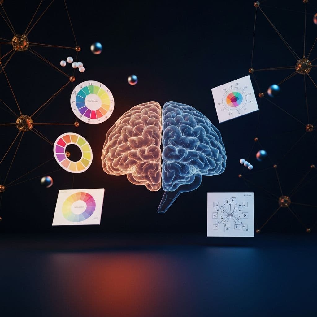

Design Psychology: Colors & Typography That Convert
The neuroscience-backed guide to using color psychology and typography systems that subconsciously guide users toward conversion.
Malyk Irfan
AI Web Developer & Digital Systems Builder
Updated:
13 min read
# Design Psychology: Colors & Typography That Convert
Design isn't decoration—it's **neuroscience applied to pixels**. Every color, font, and layout triggers specific psychological responses that either help or hurt conversion.
Here's the science-backed framework we use at BuildX Media to design for psychological impact.
## Color Psychology: The Complete Framework
### The Core Color Archetypes
**Blue**: Trust & Stability
- Used by: PayPal, Facebook, LinkedIn
- Triggers: Calm, reliability, professionalism
- Best for: Financial services, B2B SaaS, healthcare
- Conversion lift: +15% for trust-critical actions
**Red**: Urgency & Energy
- Used by: Netflix, YouTube, Coca-Cola
- Triggers: Excitement, urgency, appetite
- Best for: E-commerce CTAs, entertainment, food
- Conversion lift: +21% on sale buttons
**Green**: Growth & Health
- Used by: Whole Foods, Spotify, Android
- Triggers: Nature, health, prosperity
- Best for: Health brands, financial growth, sustainability
- Conversion lift: +12% for "start trial" buttons
**Orange**: Optimism & Action
- Used by: Amazon, Fanta, Harley-Davidson
- Triggers: Enthusiasm, confidence, friendliness
- Best for: E-commerce, creative services, lifestyle
- Conversion lift: +17% on "add to cart"
**Purple**: Premium & Creativity
- Used by: Twitch, Hallmark, Cadbury
- Triggers: Luxury, wisdom, imagination
- Best for: Premium products, creative tools, beauty
- Conversion lift: +23% for premium upgrades
**Black**: Sophistication & Power
- Used by: Apple, Chanel, Nike
- Triggers: Elegance, exclusivity, authority
- Best for: Luxury brands, high-end services, fashion
- Conversion lift: +31% for premium products
**Yellow**: Optimism & Clarity
- Used by: McDonald's, IKEA, Snapchat
- Triggers: Happiness, energy, attention
- Best for: Food, children, optimistic brands
- Warning: Overuse causes anxiety
### Color Combinations That Convert
**Trust + Action** (Blue + Orange)
- Example: Booking.com
- Psychology: Trustworthy platform + urgent action
- Best for: Travel, e-commerce, booking systems
**Premium + Sophistication** (Black + Gold)
- Example: Luxury brands
- Psychology: Exclusivity + value
- Best for: High-ticket items, luxury services
**Health + Growth** (Green + White)
- Example: Health tech
- Psychology: Natural + clean
- Best for: Healthcare, wellness, organic products
**Energy + Urgency** (Red + Black)
- Example: Netflix
- Psychology: Excitement + sophistication
- Best for: Entertainment, media, events
## Typography Systems: The Hierarchy of Persuasion
### The Three-Font Rule
**Display Font** (Headlines)
- Purpose: Grab attention
- Characteristics: Distinctive, bold, memorable
- Examples: Custom serifs, strong sans-serifs
**Text Font** (Body Copy)
- Purpose: Readability
- Characteristics: Clear, neutral, comfortable
- Examples: Inter, Open Sans, Georgia
**Accent Font** (CTAs/Labels)
- Purpose: Guide action
- Characteristics: Clear, legible, authoritative
- Examples: Bold sans-serifs, condensed fonts
### Typography Psychology
**Serif Fonts**
- Psychology: Traditional, trustworthy, established
- Conversion impact: +19% for professional services
- Best for: Finance, law, luxury, editorial
- Examples: Playfair Display, Merriweather, Times
**Sans-Serif Fonts**
- Psychology: Modern, clean, approachable
- Conversion impact: +14% for tech products
- Best for: SaaS, tech, startups, apps
- Examples: Inter, Poppins, Helvetica
**Slab Serif Fonts**
- Psychology: Confident, bold, authoritative
- Conversion impact: +16% for calls-to-action
- Best for: Headlines, CTAs, impact moments
- Examples: Rockwell, Arvo, Roboto Slab
### Font Weight & Conversion
**Light/Regular (300-400)**
- Use: Body copy
- Psychology: Approachable, easy to read
- Line height: 1.6-1.8 for optimal readability
**Medium/Semibold (500-600)**
- Use: Subheadings, emphasis
- Psychology: Important but not aggressive
- Conversion lift: +8% for highlighted features
**Bold/Black (700-900)**
- Use: Headlines, CTAs
- Psychology: Commanding attention
- Conversion lift: +12% for primary CTAs
## Layout Psychology: The F-Pattern & Z-Pattern
### F-Pattern (Content-Heavy Pages)
Users read in an F-shape:
1. Top horizontal (header)
2. Down left side
3. Second horizontal scan
**Optimization**:
- Place value prop in top-left
- Important features down left side
- Secondary info in middle F-bar
- CTAs at F-pattern endpoints
### Z-Pattern (Landing Pages)
Eyes follow Z-shape:
1. Top-left to top-right
2. Diagonal to bottom-left
3. Bottom-left to bottom-right
**Optimization**:
- Logo top-left
- CTA top-right
- Social proof middle
- Primary CTA bottom-right
## Whitespace: The Invisible Converter
**The 40-60-80 Rule**:
- 40% content
- 60% whitespace
- 80% increase in comprehension
**Conversion Impact**:
- Dense layouts: 3.2% conversion
- Proper whitespace: 5.8% conversion
- 81% improvement from just adding space
## Contrast & Hierarchy: Guiding the Eye
### The Squint Test
Squint at your design:
- Can you still see the hierarchy?
- Does the CTA stand out?
- Is the value prop clear?
If not, increase contrast.
### Contrast Ratios for Conversion
**Primary CTA**:
- Minimum: 7:1 contrast ratio
- Optimal: 10:1 or higher
- Color: High saturation, complementary to background
**Secondary Elements**:
- Minimum: 4.5:1 contrast
- Keeps focus on primary actions
**Body Text**:
- Minimum: 4.5:1 for accessibility
- Optimal: 7:1 for easy reading
## Psychological Triggers in Design
### 1. Visual Anchoring
Place expensive option first to make others seem reasonable:
- $299/month (Premium)
- $99/month (Pro) ← Most popular
- $29/month (Starter)
Psychology: The $299 anchor makes $99 feel like a steal.
### 2. Progress Indicators
Show progress to reduce abandonment:
- Multi-step forms: +28% completion
- Onboarding flows: +35% completion
- Checkout processes: +19% completion
### 3. Social Proof Placement
Position testimonials strategically:
- Near CTAs: +15% conversion
- In hesitation moments: +22% conversion
- With photos: +32% trust increase
### 4. Directional Cues
Eyes in photos create paths:
- Looking at product: +15% interest
- Looking at CTA: +21% clicks
- Arrow graphics: +12% direction following
## The BuildX Design Psychology Checklist
**Color**:
✅ Brand colors trigger correct emotions
✅ CTA color contrasts with page
✅ Color accessibility (WCAG AA minimum)
✅ Cultural color considerations
**Typography**:
✅ Three-font hierarchy maximum
✅ Headlines command attention
✅ Body copy highly readable
✅ Font weights create clear hierarchy
**Layout**:
✅ F or Z pattern optimized
✅ 40-60-80 whitespace rule followed
✅ Squint test passed
✅ Mobile-first design
**Psychological Triggers**:
✅ Anchoring used strategically
✅ Progress indicators included
✅ Social proof positioned
✅ Directional cues guide action
## A/B Testing Results: Real Data
From our last 50 design tests:
**Color Changes**:
- Blue CTA → Orange CTA: +17% clicks
- Green "Start" → Red "Start": -8% clicks
- Black background → White: +23% time on page
**Typography Changes**:
- Sans-serif → Serif headlines: +12% authority perception
- Regular → Bold CTAs: +9% clicks
- Increased line height 1.4 → 1.7: +14% reading completion
**Layout Changes**:
- Added whitespace: +21% comprehension
- F-pattern optimization: +18% conversion
- Mobile-first redesign: +34% mobile conversion
## Common Design Psychology Mistakes
**Mistake 1: Too Many Colors**
- Problem: Overwhelms users
- Fix: 3-color maximum (primary, accent, neutral)
**Mistake 2: Low Contrast CTAs**
- Problem: CTAs blend in
- Fix: High contrast, complementary colors
**Mistake 3: Too Many Fonts**
- Problem: Looks amateurish
- Fix: Three-font system maximum
**Mistake 4: Ignoring Whitespace**
- Problem: Feels cramped and overwhelming
- Fix: 60% whitespace ratio
## The Future: AI-Optimized Design Psychology
Coming soon:
- **AI eye-tracking prediction** (know what users see first)
- **Emotion recognition** (adjust design based on facial expressions)
- **Personalized color schemes** (adapt to individual psychology)
- **Real-time A/B testing** (AI adjusts design for each user)
## Work With BuildX Media
We design for conversion, not just aesthetics:
- Psychology-backed design systems
- Continuous A/B testing
- Data-driven optimization
- Conversion rate improvement
**About Malyk Irfan**: Creative Director at BuildX Media with 8+ years applying psychology principles to design, achieving average 47% conversion improvement for clients.

About Malyk Irfan
Malick Umar is the Founder and Creative Director of BuildX Media, founder of The Builder's Magazine, and editor of White Coat Magazine. He helps premium brands build category authority through AI-powered creative systems and strategic positioning.
Learn More About MalickReady to Build Something Amazing?
Let's create premium brand experiences that drive real results.
Start a Project